Coreana Bio Cellzion
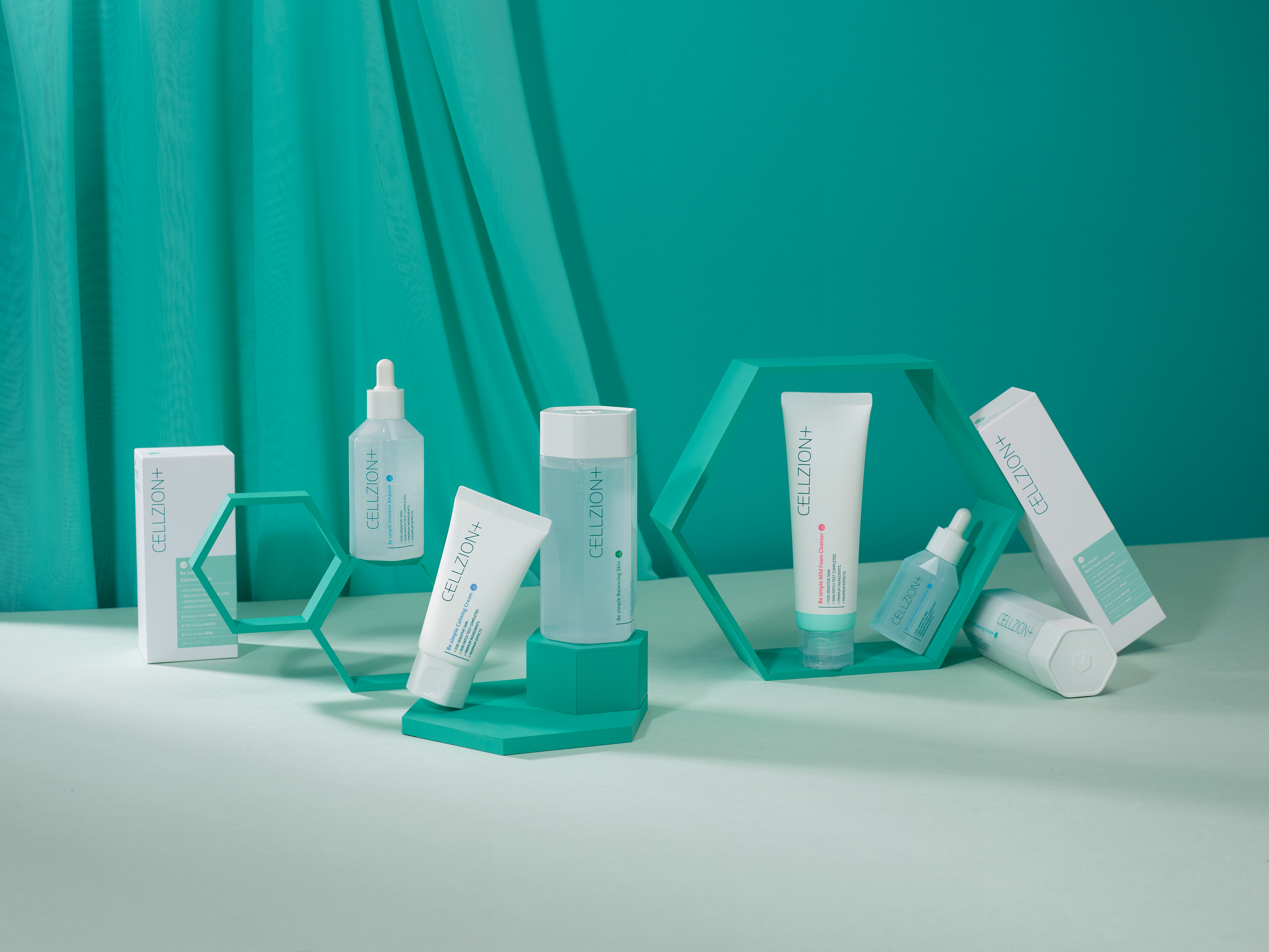
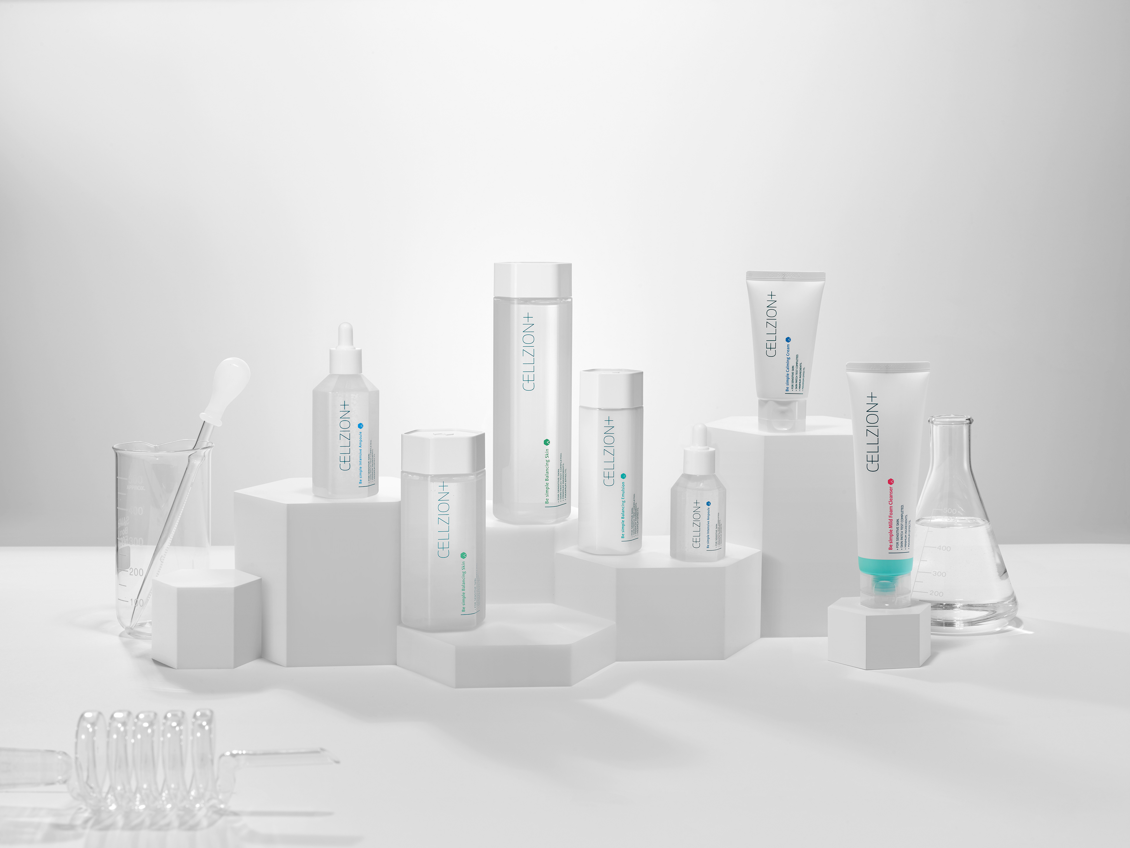
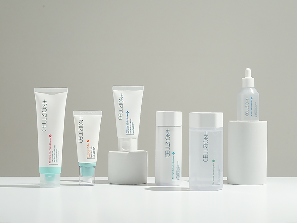
코리아나 바이오의 신규 브랜드 '셀지온'이 피부에 활력과 에너지를 전달하는 안전한 화장품이라는 아이덴티티를 확립하기 위한 브랜딩 및 패키징 디자인 프로젝트를 주도했습니다.
브랜드의 핵심 가치인 '세포'의 도형적 형상화에 초점을 맞춰, 전체 라인에 육각형 용기와 캡을 일관되게 적용하여 통일성과 정교한 이미지를 구축했습니다. 최상의 안전성을 전달하기 위해 용기 소재로 유아용 젖병에 사용되는 안전한 소재를 채택했습니다.
기능적으로 이 육각 형태는 기존 원형 용기의 여닫을 때 발생하는 미끄러짐 문제를 개선하는 효과도 가져왔습니다. 셀지온 프로젝트는 시각적 상징성, 안전한 소재, 사용 편의성을 모두 통합한 디자인 솔루션을 제시했으며, 금형 제작 및 국내외 디자인 특허 등록으로 디자인의 현실적 완성도를 확보했습니다.
I led the branding and packaging design project for Coreana Bio's new brand, 'Cellzion,' with the goal of establishing its identity as a safe cosmetics brand delivering vitality and energy to the skin.
To visually embody the brand's core value 'the cell', I focused on its geometric visualization, consistently applying a hexagonal shape to the containers and caps across the entire product line to build uniformity and a precise image. To convey maximum safety, I adopted a safe plastic material used in baby bottles for the packaging.
Functionally, the hexagonal shape also mitigated the common slippage issue that occurred when opening and closing traditional cylindrical containers. The Cellzion project delivered a design solution that seamlessly integrated visual symbolism, safe materials, and user convenience, and I ensured its realistic completion through mold manufacturing and domestic/international design patent registration.