iBeBe Product Detail Page Renewal
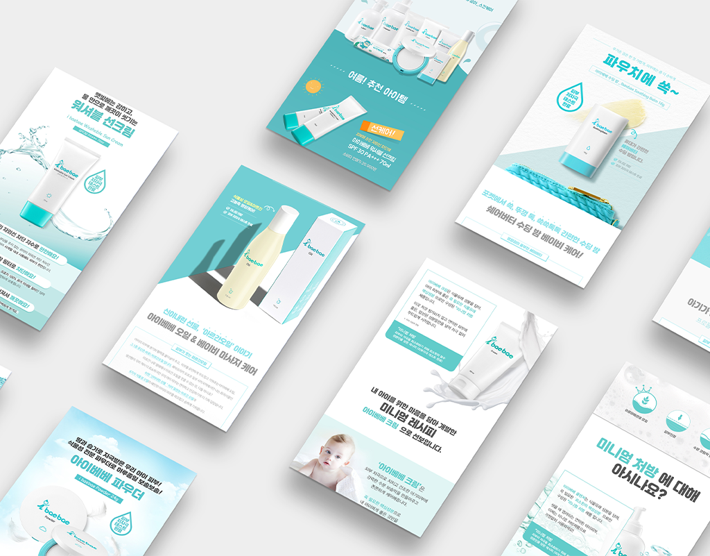
진셀팜의 어린이 화장품 브랜드 아이베베(iBeBe) 상세페이지 리뉴얼 프로젝트는 어린이용 화장품으로써의 안정감과 신뢰도를 시각적으로 전달하는 데 중점을 두었습니다.
모듈형 레이아웃을 채택하여 이벤트 페이지 추가에도 유연하게 대응할 수 있도록 구조적 안정성을 확보했습니다. 색감은 어린이 화장품의 경쾌함은 유지하되, 과하지 않은 안정적인 청록색 기반 팔레트를 적용하여 색감적 신뢰도를 높였습니다.
가장 중요하게, 부모 소비자를 위해 핵심 성분 및 안전성 테스트 결과와 같은 신뢰 기반 정보를 페이지 내에 효과적으로 배치하고 시각적으로 강조하여 정보를 구조화했습니다. 이로써 아이베베는 마케팅 유연성과 함께 안전 및 신뢰도를 시각적, 구조적으로 강화한 상세페이지를 확보했습니다
The detail page renewal project for the children's cosmetics brand iBeBe (part of the Ginsefarm line) was executed to visually convey stability and trust.
A modular layout was adopted to ensure structural stability and flexible accommodation of frequent event page additions. The color strategy used a stable palette—maintaining the cheerfulness of children's cosmetics while avoiding excess—to enhance chromatic trustworthiness.
Crucially, trust-based information such as core ingredient details and safety test results was effectively positioned and visually emphasized to reassure parent consumers. This successful design enhanced marketing flexibility while structurally and visually reinforcing product safety and credibility for iBeBe.