I'm Sorry For My Skin - Relaxing Cream Ampoule
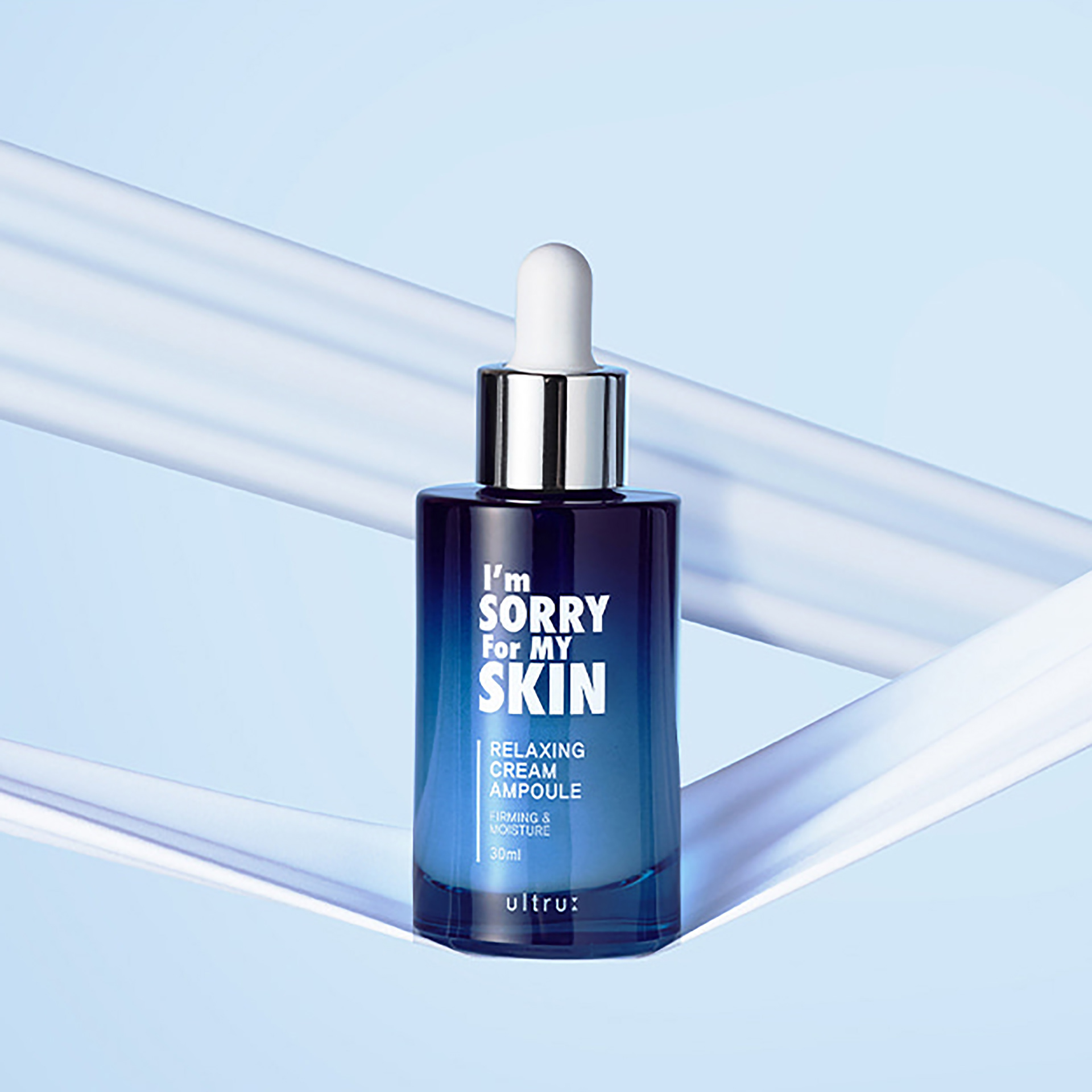
아임쏘리포마이스킨의 신제품 '릴랙싱 크림 앰플' 패키징 디자인 프로젝트를 진행했습니다. 브랜드 고유의 자극적인 아이캐칭 아이덴티티를 유지하는 동시에, 신제품의 제형적 특성과 결합하여 심리적 안정성을 강화하는 데 중점을 두었습니다.
이를 위해 주된 색감으로 블루 컬러를 적용했습니다. 블루 컬러는 시각적인 안정감을 제공하는 동시에, 크림 앰플 제형이 주는 쿨링감과 진정 효과라는 제품의 기능적 속성을 명확하게 전달했습니다.
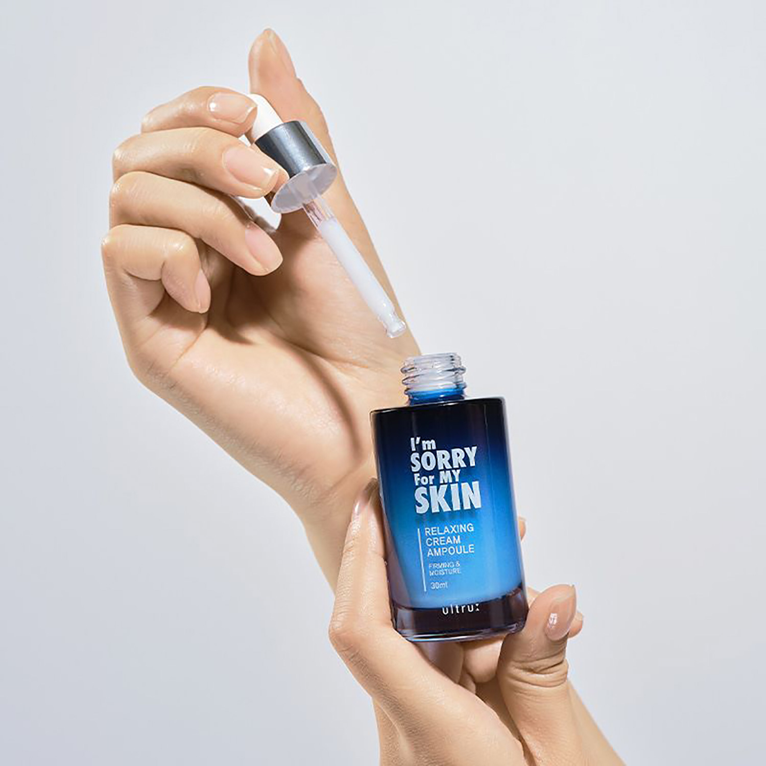
결과적으로, 이 디자인은 독특한 브랜드 정체성을 유지하여 즉각적인 시장 주목도를 확보했으며, 색감 중심의 전략을 통해 제품의 기능성을 명확하게 전달하는 성공적인 솔루션이었습니다.
I led the packaging design project for I'm Sorry for My Skin's new 'Relaxing Cream Ampoule.' The design focused on maintaining the brand's unique, provocative, eye-catching identity while strategically integrating it with the product's formulation to enhance psychological stability.
I achieved this by adopting blue as the primary color. The blue hue not only provided a sense of visual stability but also maximized the perceived cooling and soothing functional attributes associated with the cream texture.
Ultimately, the design was a successful solution that preserved the unique brand identity for immediate market attention and clearly communicated the product's functionality through a color-centric strategy.